

WOLF retro DESIGN REVIEW. 29th July 2022
Silver has always meant something special when it comes to Yamaha keyboards. The DX7C in silver was representative of Yamaha’s 100-year anniversary. Then at the turn of the century in 1999 the EX5s was another celebration in silver. Was this PS-55S where that idea began?
A retro review looks at products that are at least over ten years old from a present-day WOLF design perspective. While the technology and fashion of the period influence design, and are taken into consideration, great design ideas will transcend their eras to be timeless.
Interesting and factual information may be provided, but our review aims to deliver insight from the perspective of a designer’s mind and eyes.
The beginnings of silver?
Introduction
Product Focus
As with most reviews the focus is on the design and its evolution within the industry. The functioning systems and sound quality are not necessarily considered.
Product description
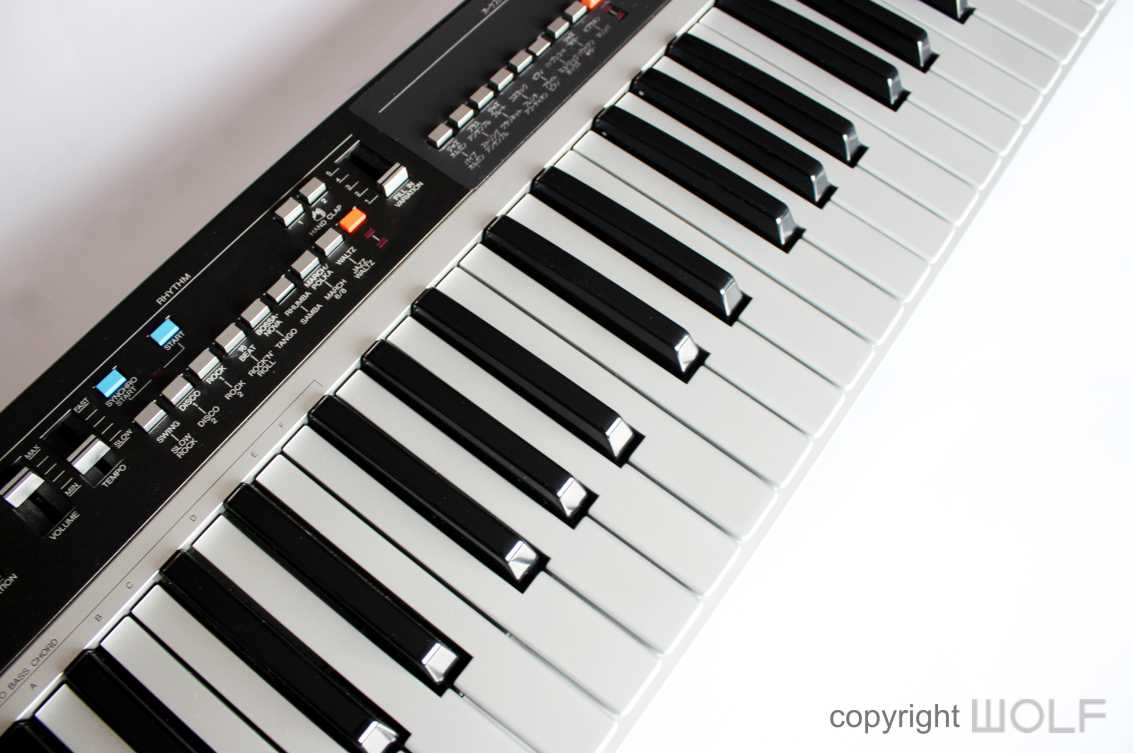
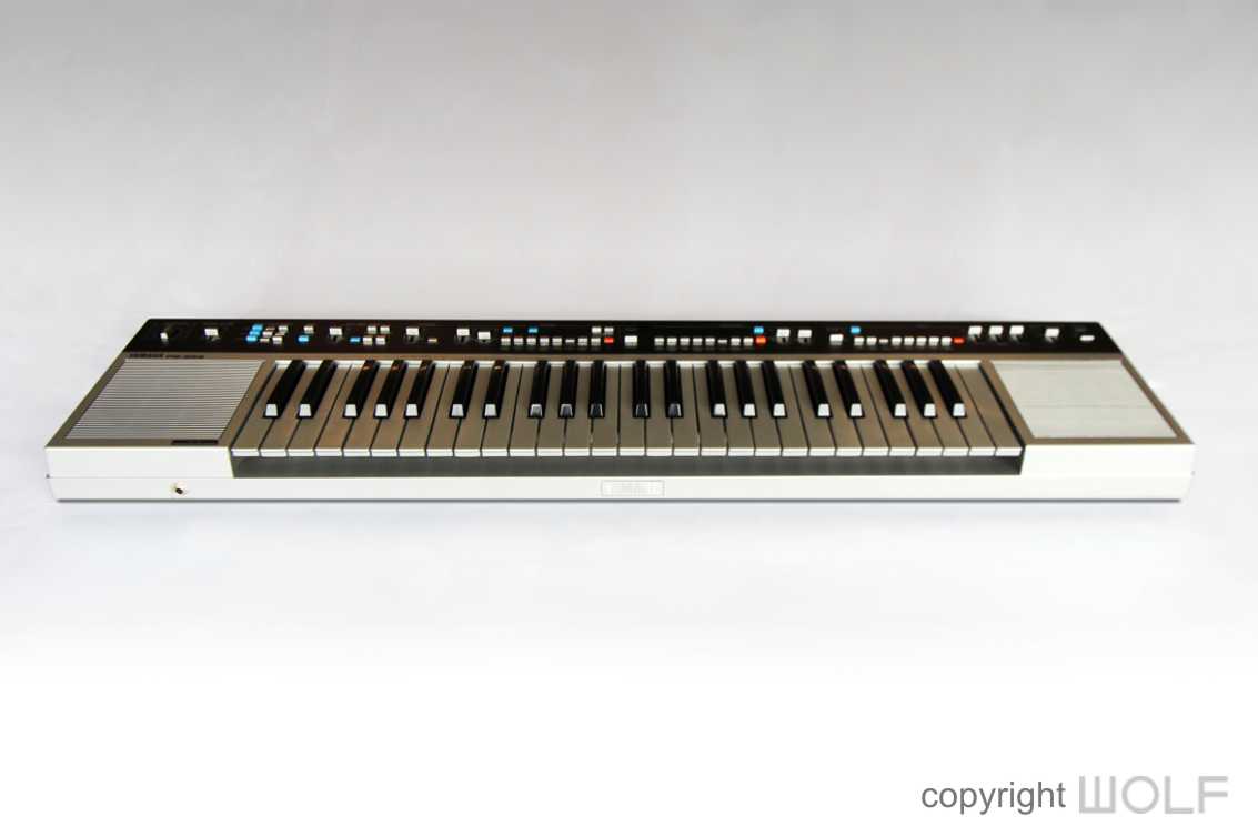
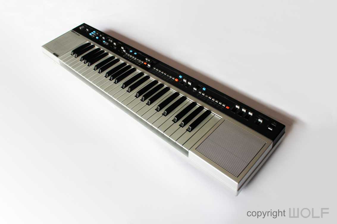
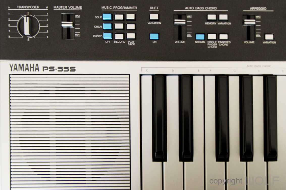
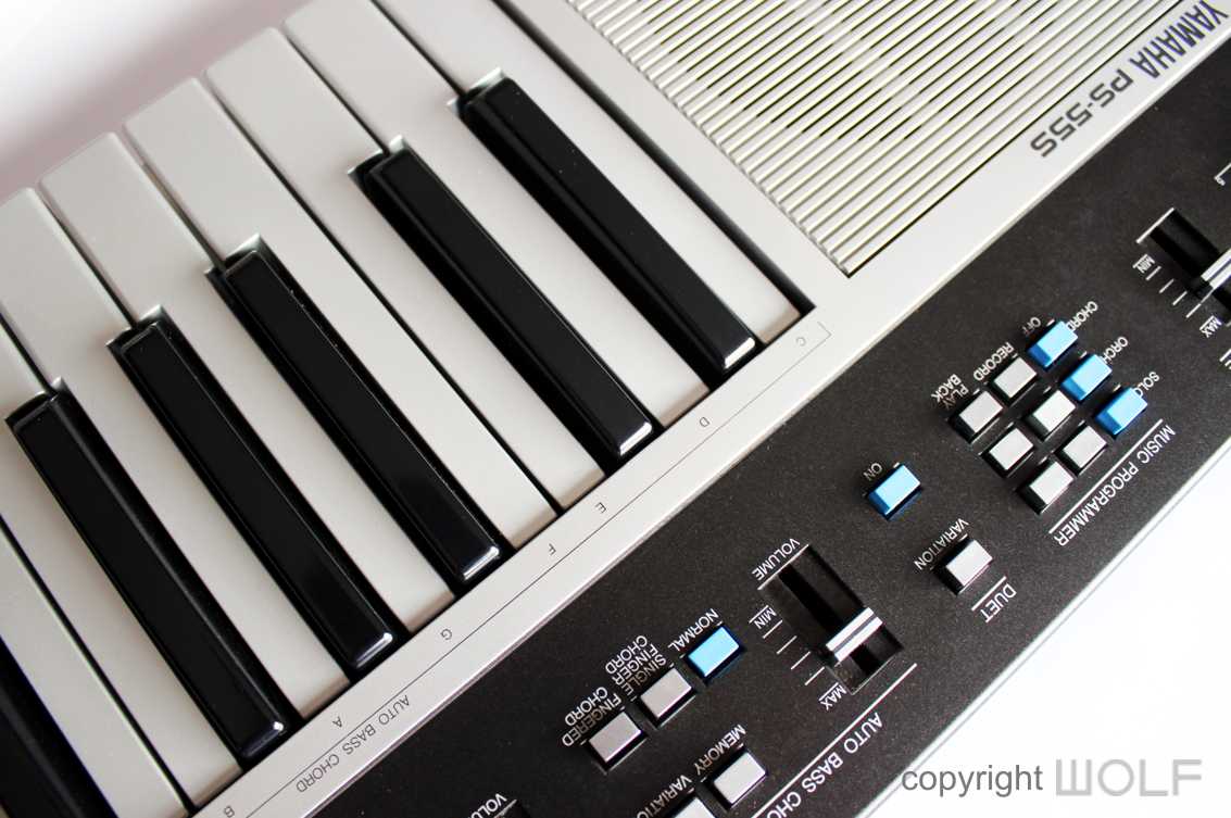
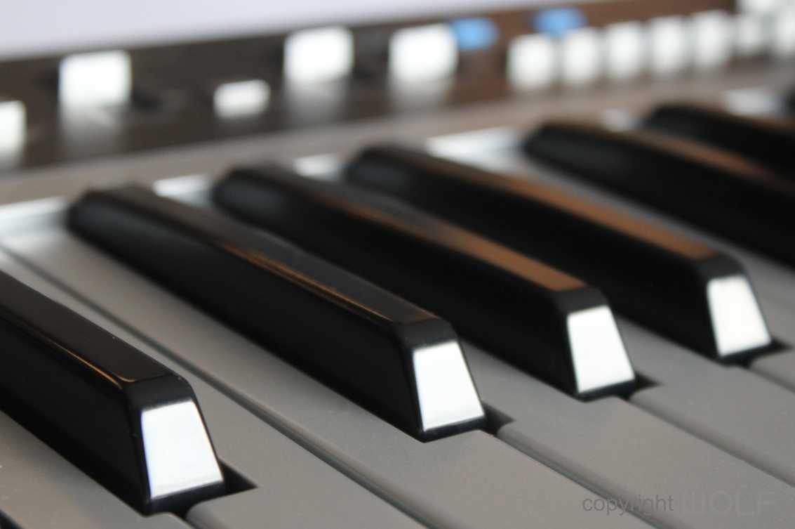
The PS-55S was a special edition of the PS-55, a 49 key home keyboard released in 1983. The “S” represents both being “Silver” and “Special”. Functionally the PS55S and PS-55 are identical. The only difference is in the colour and that extends to the keys themselves which are in a matt silver colour.
Price and Availability.
Although rarer and more unique than the regular gold PS-55, the silver version does not always command a higher price tag. Expect to pay anywhere from $100 to $200 for a good one. You might pay more for one with original case, cover, manual and stand.
Additional information
The PS-55S and the PS-55 were the top of the PS range which included three smaller models – the PS-35, PS-25, and the PS-15.
Review.
Most of our comments will be similar to those made when we reviewed the standard PS-55, though being silver does bring a few subtle differences in mood.
First impression/ Delight
The PS-55S is very silver, and that’s very striking since even the keys are silver. It’s also simple looking and economical in size. Further to its minimalistic geometry it has a two-toned colour scheme that gives a very retro feel, though not quite as retro as the more regular gold version (in our opinion).
Exterior Design Review
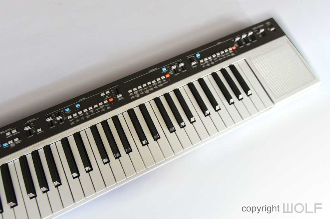
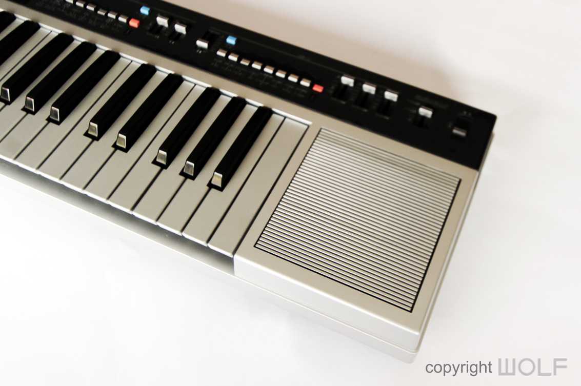
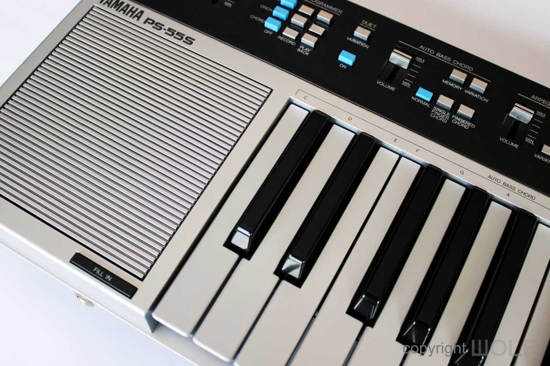
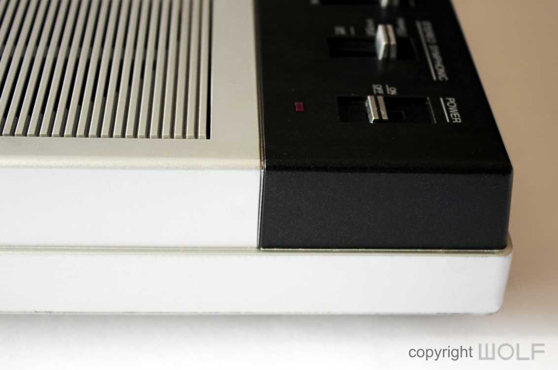
Everything is flat linear and at 90 degrees. A darker toned top panel runs the full length of the unit and incorporates all the controllers. Below this is the 49 key keyboard with speakers either side. This is housed in silver casing. It’s a bit less classy than the PS-55 but does feel a little more Hi-tech, especially for 1983.
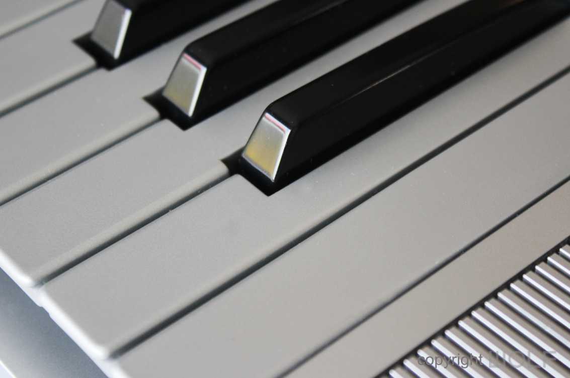
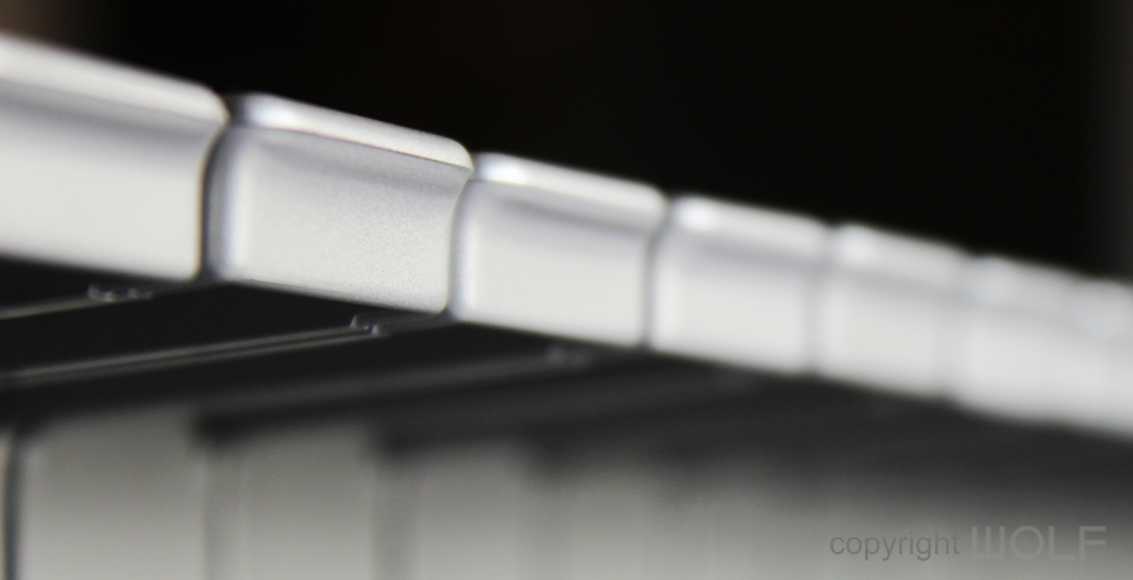
Although very square overall, the corners and edges are rounded off to feel more soft and friendly. We like the speaker grills which are neat and flush. The small gaps between each bar minimises visible dirt in between. Overall, this keyboard is completely devoid of any decorative ornamentation or aesthetic design features with one big exception. The keys on this keyboard are in silver, and possibly the first in the World break away from ivory.
Craftmanship.
The PS-55S is all made of plastic but it is thick and durable. We have not seen many with bad damage. The silver finish is just paint over plastic so units that have had a lot of use will have shiny paint ware around the buttons and in the corners. The keys also seem to be painted.
All buttons and sliders were made to be strong and durable. They press and slide well, but do feel rather basic.
FUNCTION- Experience.
The buttons are a little small in our opinion and the way they are grouped and arranged took a while to understand. There is no screen or LED which was appropriate for 1983, but the technology was available and we think a simple display might have made a big difference.
The compact size, makes this a very transportable instrument, and most came with a soft carrying case. They also came with a music stand which cleverly clips into the underside when not required.
Desirability / Collectability and what to look for.
The PS-55S was a quality keyboard and the design and craftsmanship reflect this well. Most are still in perfectly functioning order. It had a lot of functions so can seem complicated at first but most people will find it quite fun and novel. The sound quality is surprisingly good for a home keyboard that is now almost 40 years old. Make sure you get one with its case. In the USA the PS-55S had a molded plastic hard case that offered better protection to the more common silver soft cases.
WORD OF THE WOLF
It almost seems as if this synthesizer was forced onto the market because the SY99 was getting a bit old and they needed a new product to compete with other brands. In hind sight they probably could have just given the SY99 an upgrade until the EX5 model was ready and available in 1998.
Nevertheless, the W5 & W7 still form a part of the Yamaha’s Synthesizer story and if you do find yourself in front of a mint specimen it would be worth knowing that they are very rare. People are not going to rush into buying them when they come up for sale, so most likely you could demand a bargain.
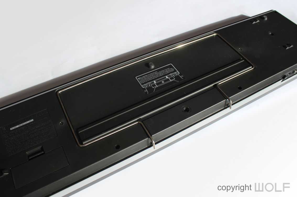
The music stand cleverly clipped into the underside for storage
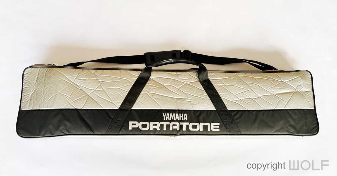
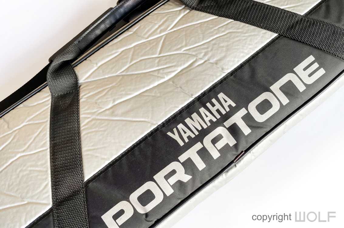
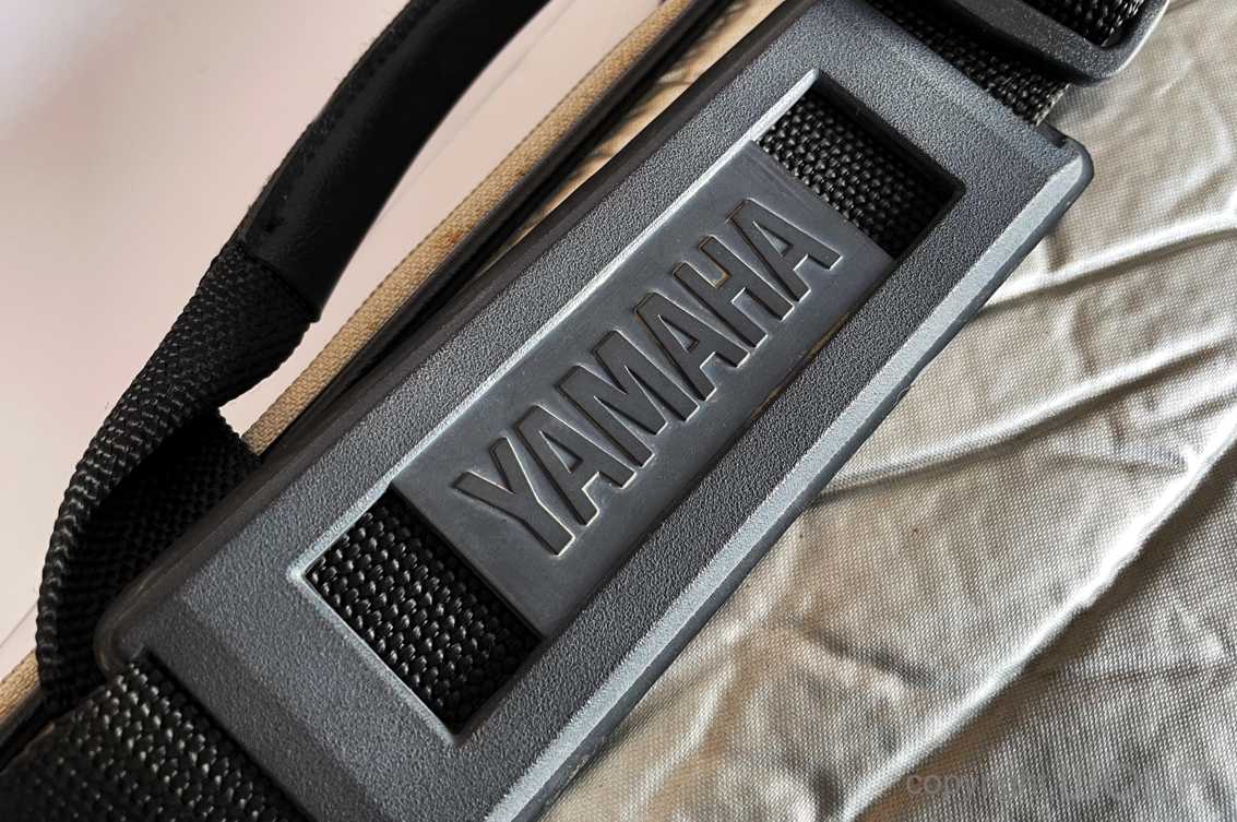
The case followed on the two-toned colour theme as with the keyboard itself. Substantial logo detail in the rubber handle.
WOLF DESIGN EXCELLENCE SCORE = 6.9
Disclaimer
The information in this review is intended for informational or educational purposes to provide readers an understanding of how something may be seen from a certain design perspective. In this case it is from the view point of WOLF DESIGNS. As design is subjective this review should only be considered as an independent opinion. Information further to being of an opinion is provided to the best of our knowledge based on our own research at the time of doing the review. We cannot be held responsible for any inaccuracies or inconsistencies and reserve the right to change or update any content as appropriate.
The final responsibility of the design resides with the original manufacturer.
Taras WOLF retro DESIGN REVIEW. 25th November 2019
A retro review looks at products that are at least over ten years old from a present-day WOLF design perspective. While the technology and fashion of the period influence design, and are taken into consideration, great design ideas will transcend their eras to be timeless.
Interesting and factual information may be provided, but our review aims to deliver insight from the perspective of a designer’s mind and eyes.
A forgotten plain Jane
Introduction
Product Focus
As with most reviews the focus is on the design and its evolution with the synthesizer. The functioning systems and sound quality are not necessarily not considered.
Product description
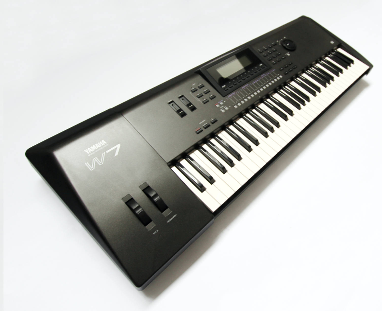
The Yamaha W7 is a workstation and successor to the highly successful SY series. It was released in 1994 together with the W5 which is almost identical except that it has one more octave. This was the first time Yamaha released two variations of the same machine to give customers a choice between 61 and 76 keys [Todays models are normally released with 61, 76, and 88 Key variations].
Price and Availability.
They were not popular because they did not appear to offer much more than their predecessors. With no major technological advancement or design developments, musicians mostly decided to hang on to their SY synths or turn to other manufacturers like Roland and KORG. As such they did not sell well and this has made them quite rare. The W7 is more commonly found than its bigger brother and is worth between $250 and $450. We would expect to pay $500+ for a mint example that comes complete with accessories such as original case, manuals, pedals and sound disks. There was a Version 2 upgrade which was distinguished only by a golden sticker that said “Version 2”.
Additional information
Unlike the previous DX and SY ranges where Yamaha profited over many smaller models, there were no other spin offs designated with a “W”. There was the QS300 released shortly afterwards which beared some resemblance to the W7 in size and design. Unlike most other Yamaha synthesizer ranges the W series had no rack module equivalent which was probably due to its lack of popularity.
Review
First impression/ Delight
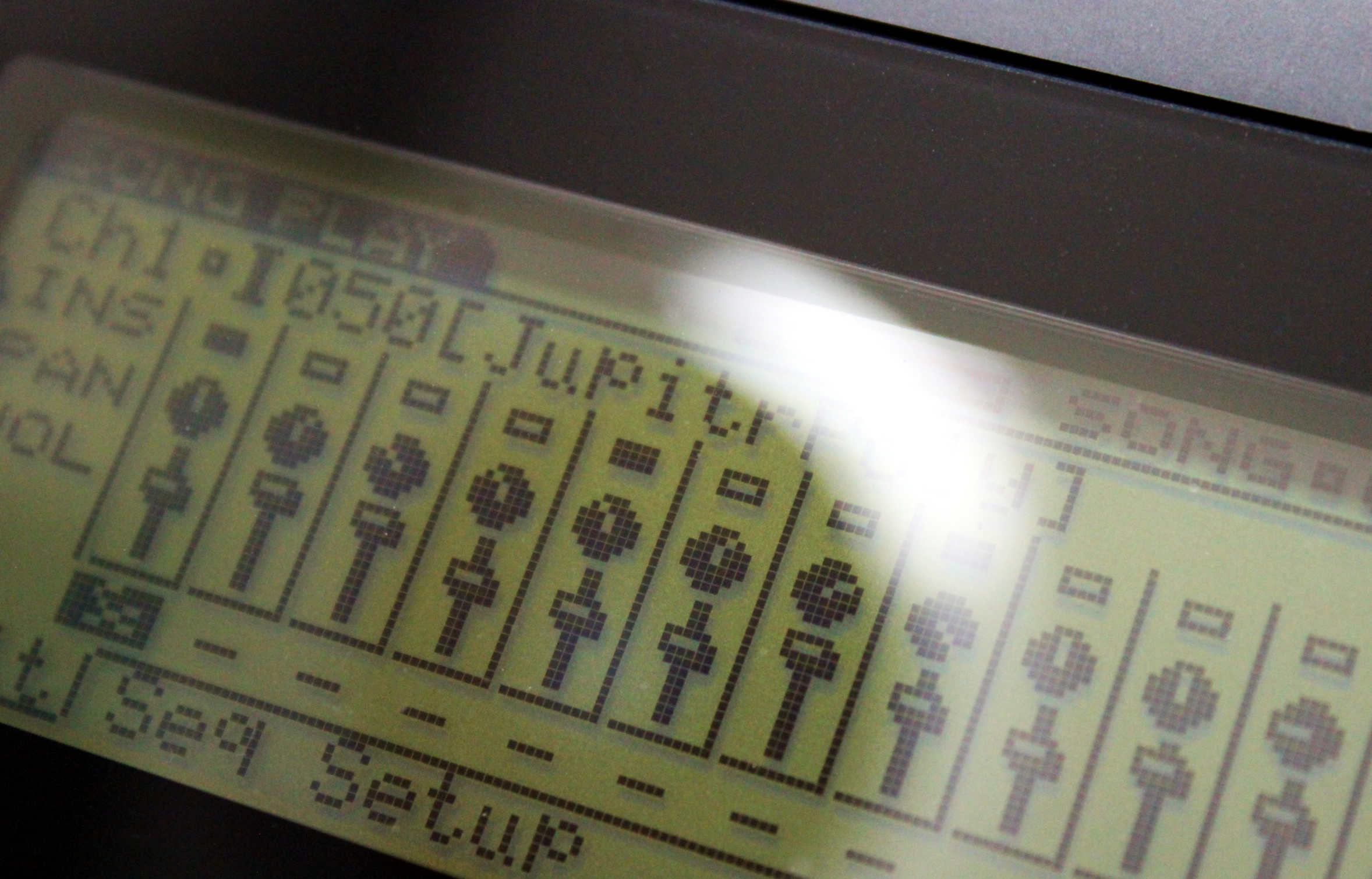
We reviewed the W7s big brother (the W5) two years earlier and many of our views remain the same today as they did back then. The W synths look rather basic and not a big leap forward from the previous flagship model. The screen remained the same as previous models, and at a time when KORG produced synths with screens twice the size, Yamaha’s screens across all their product range at that time were inadequate by comparison.
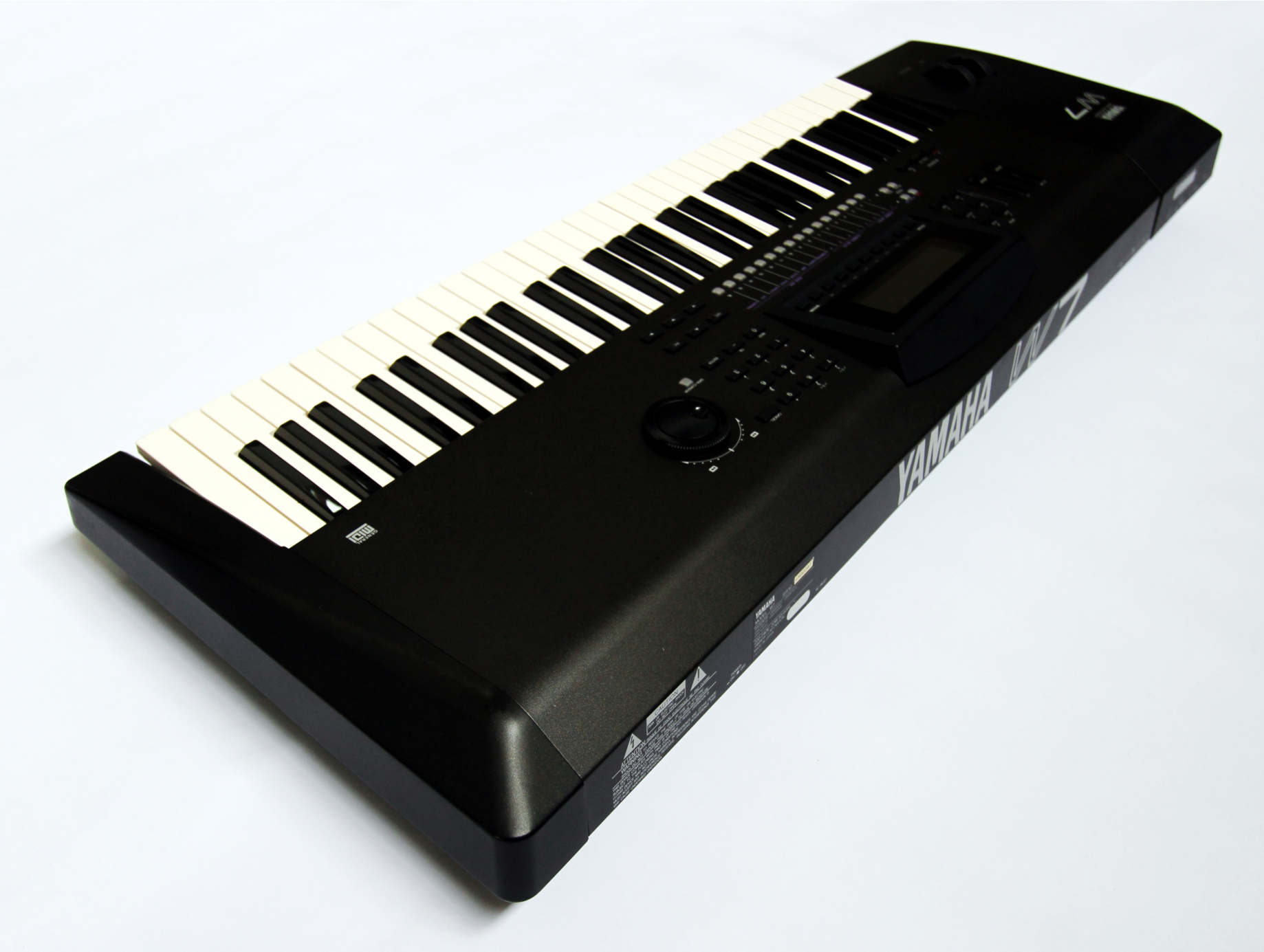
Exterior Design Review
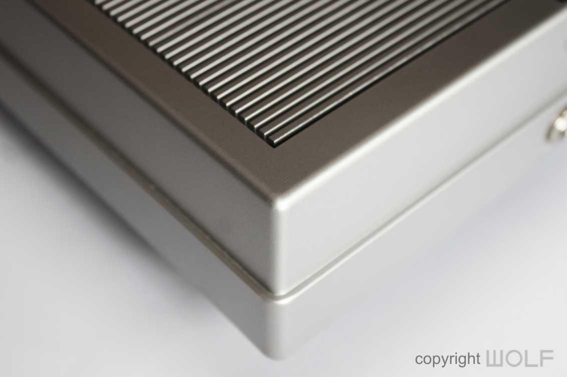
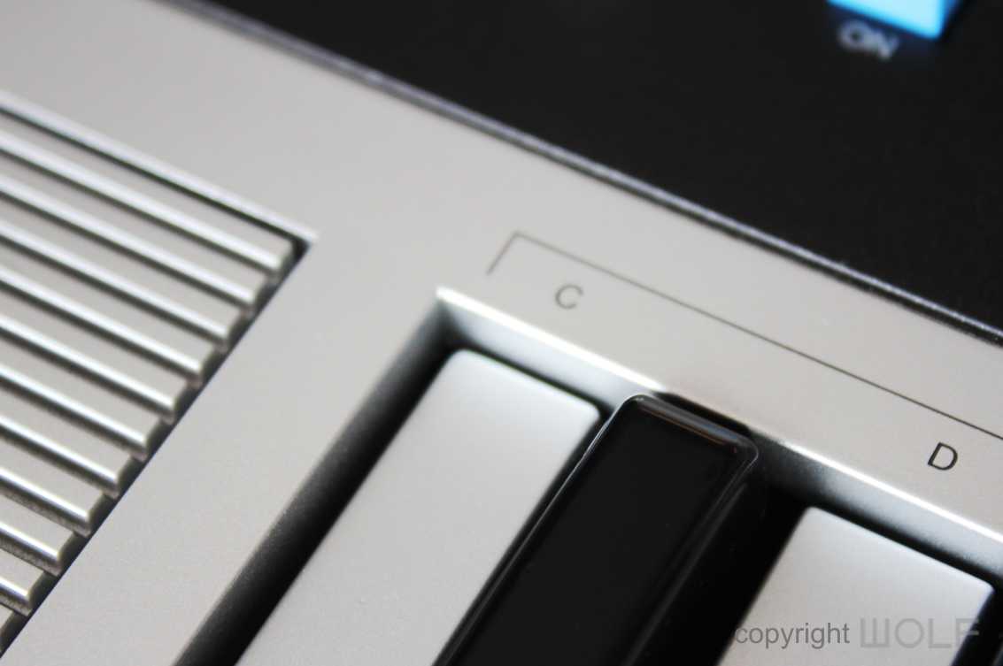
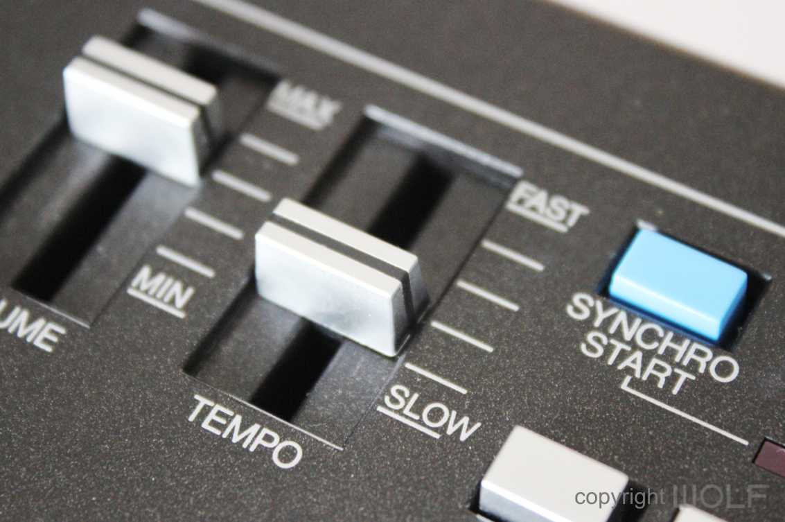
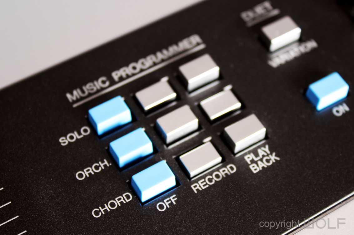
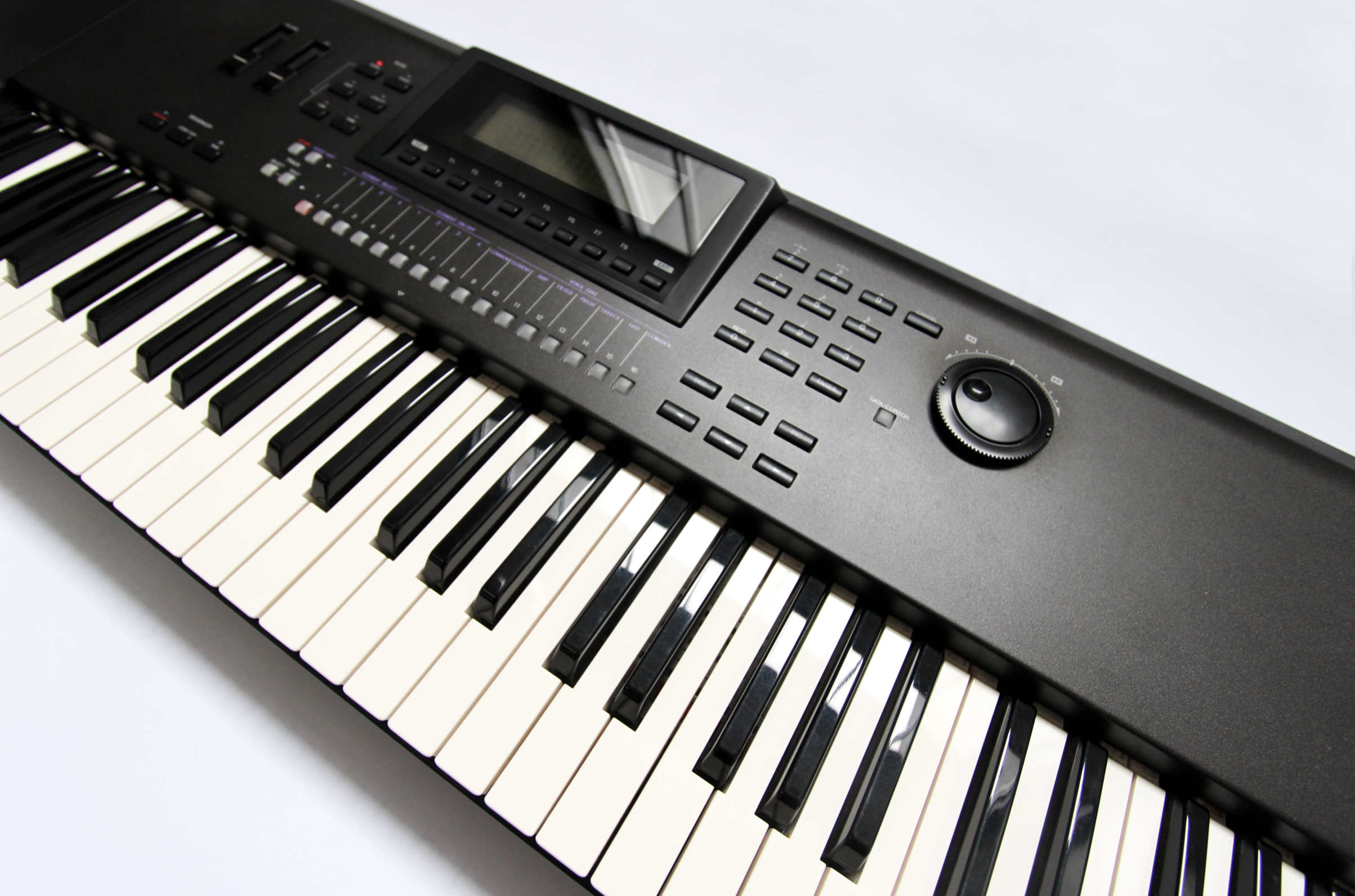
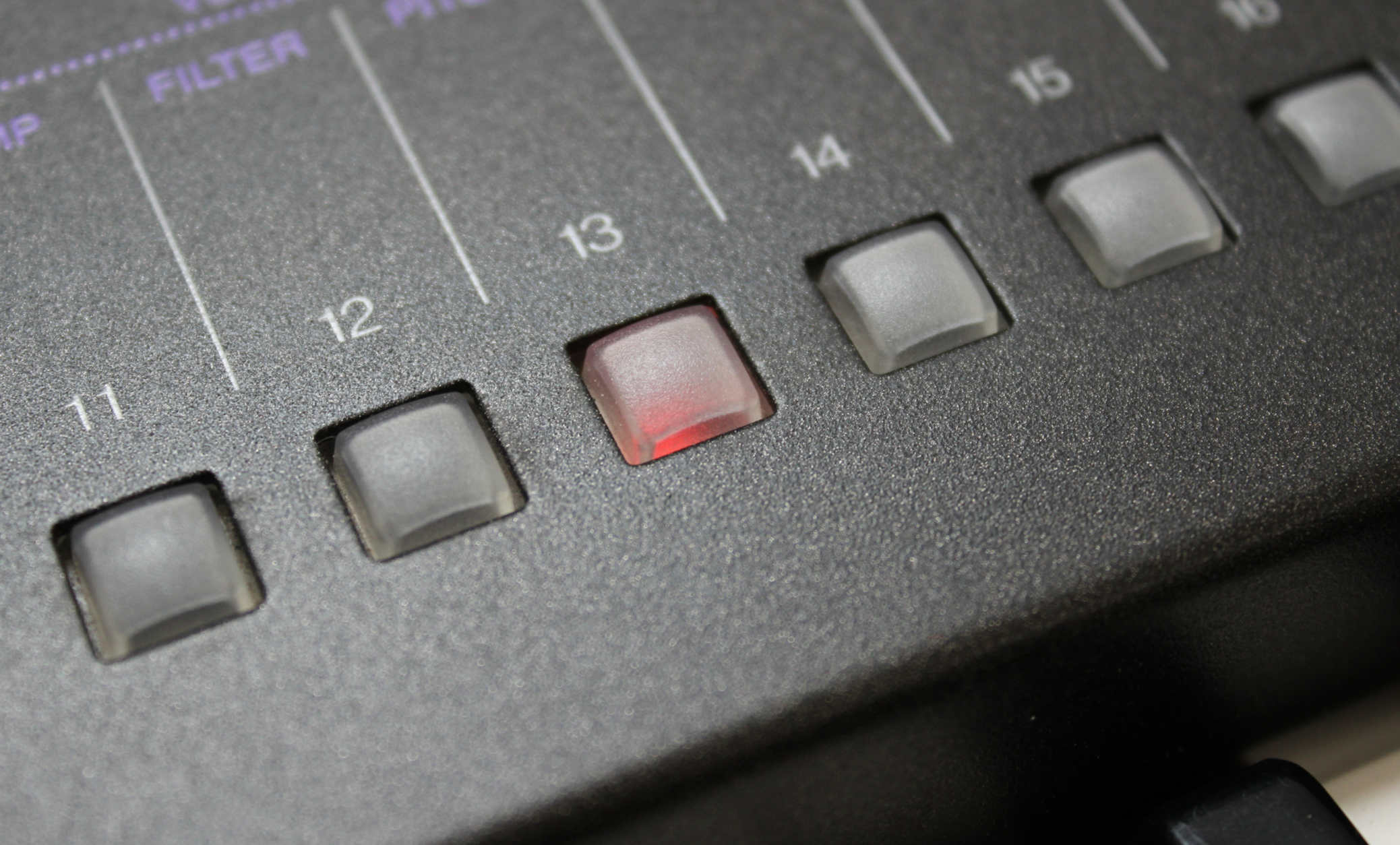
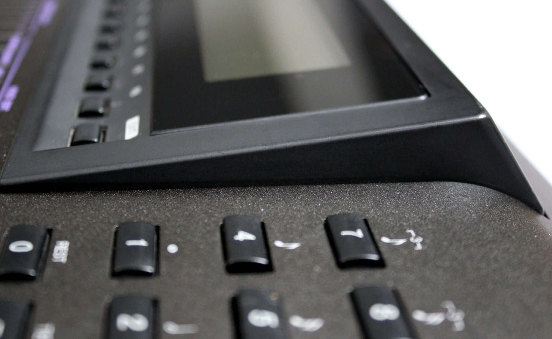
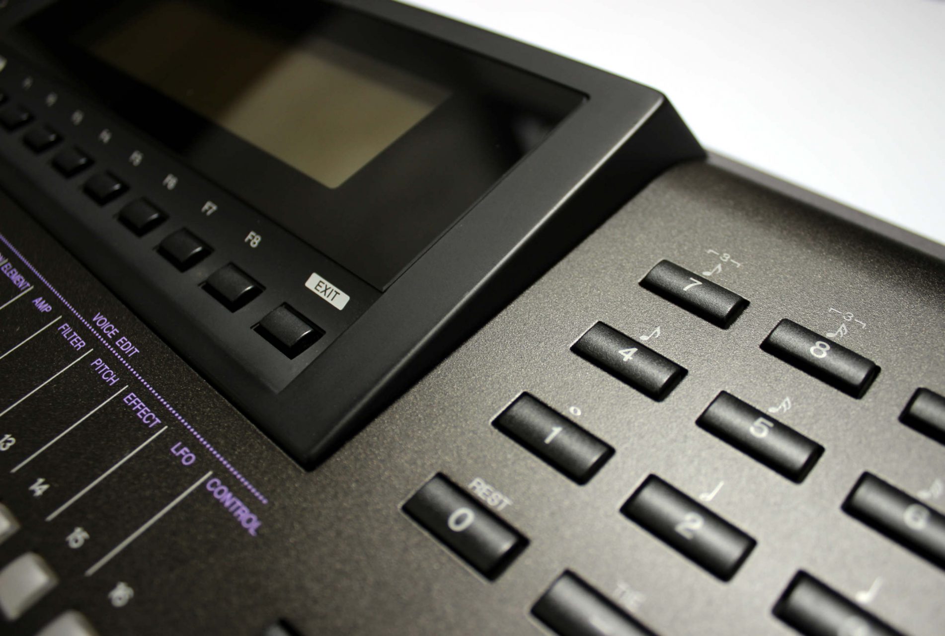
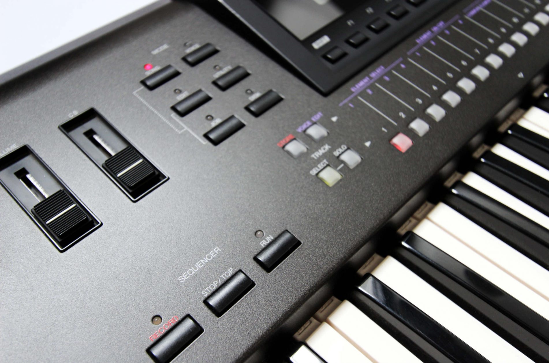
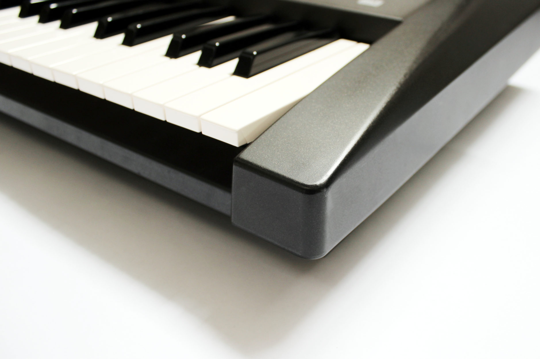
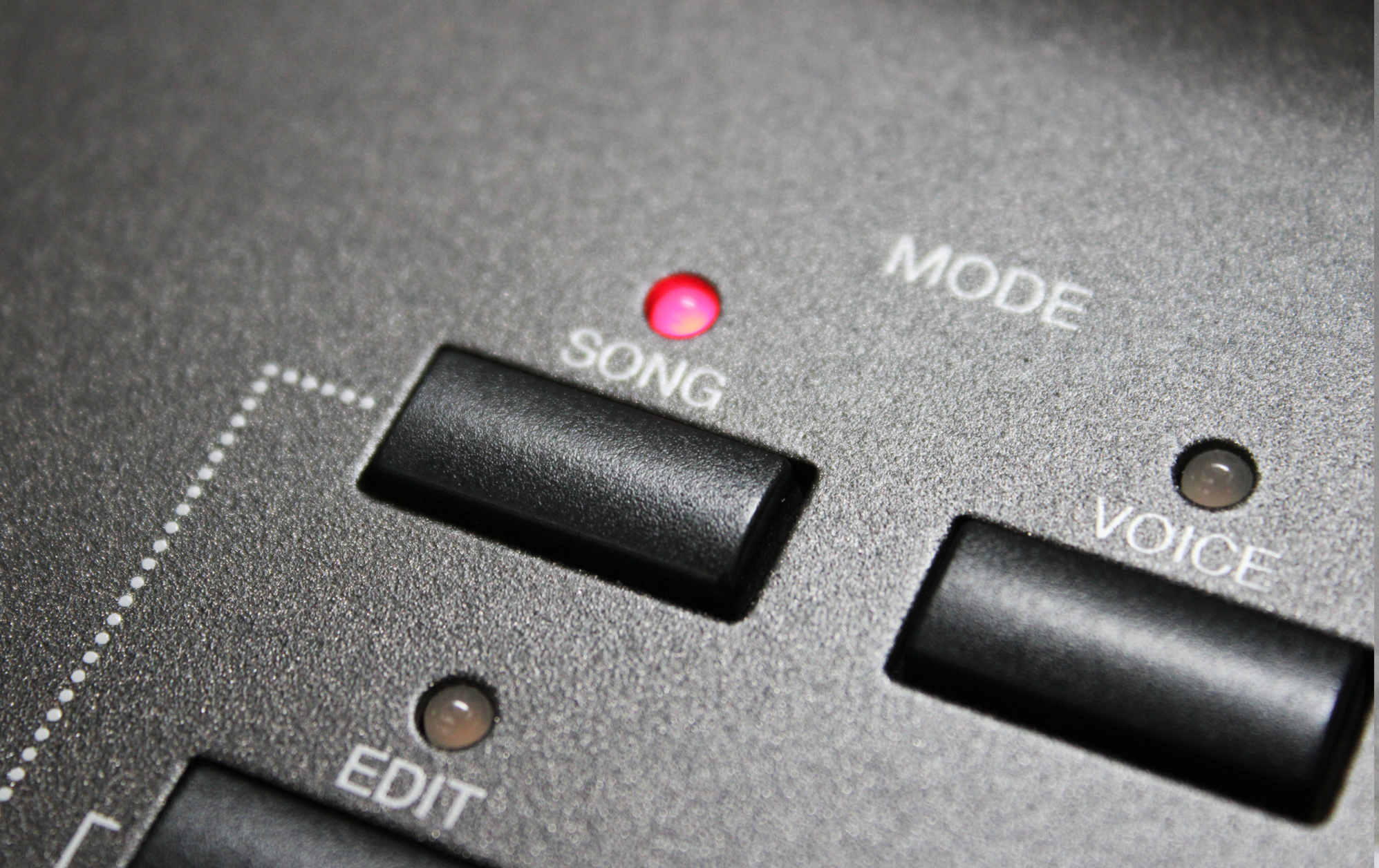
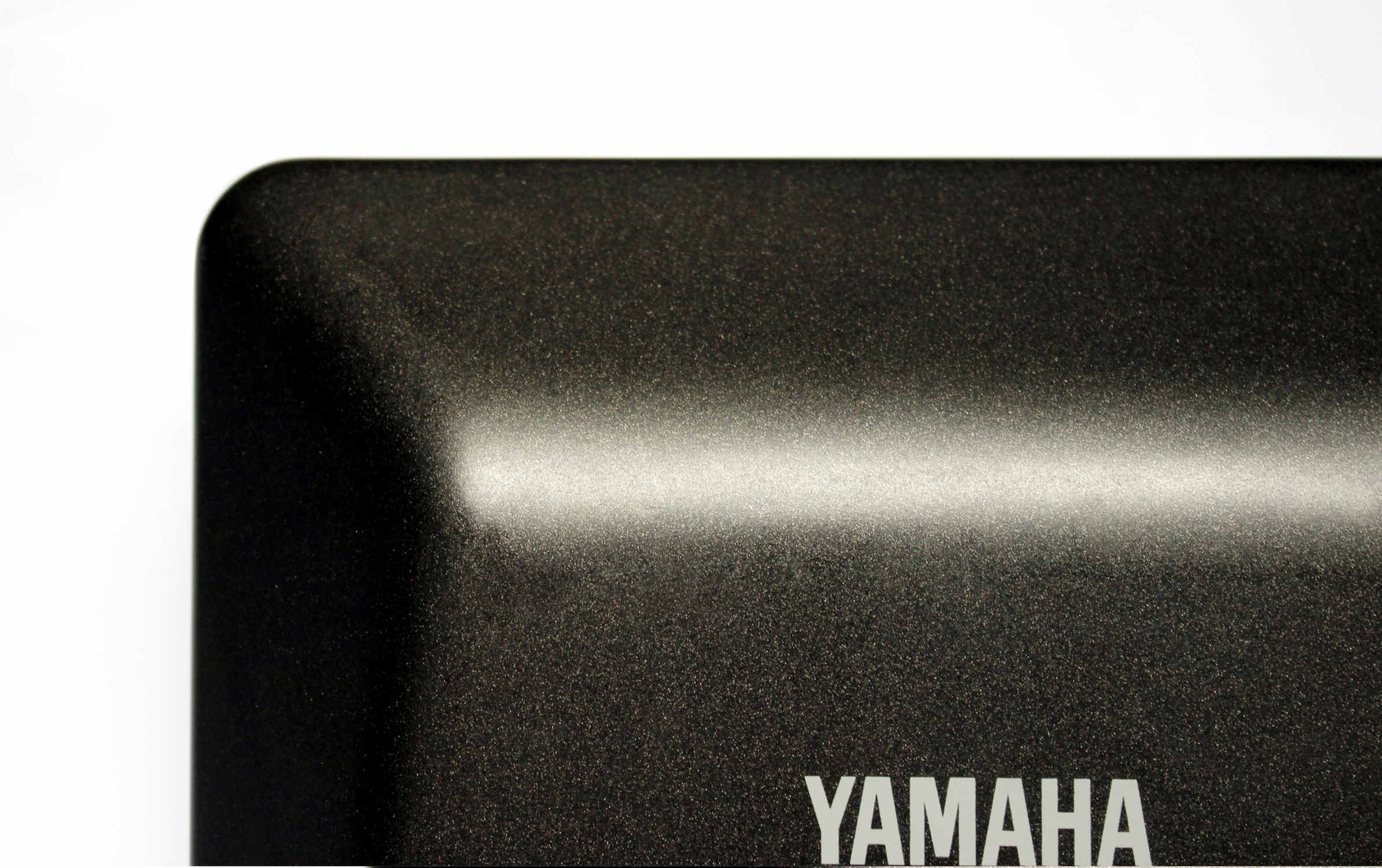
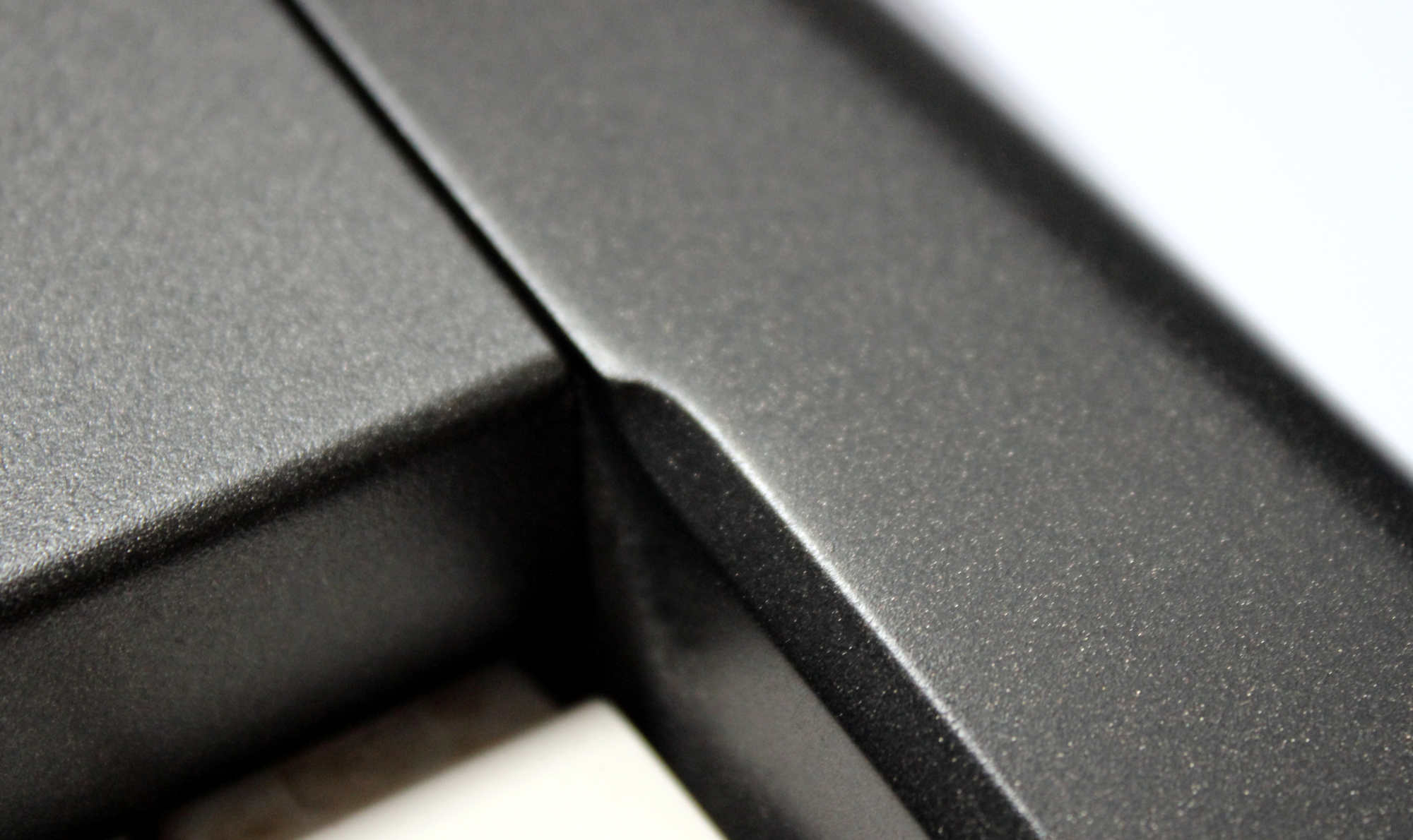
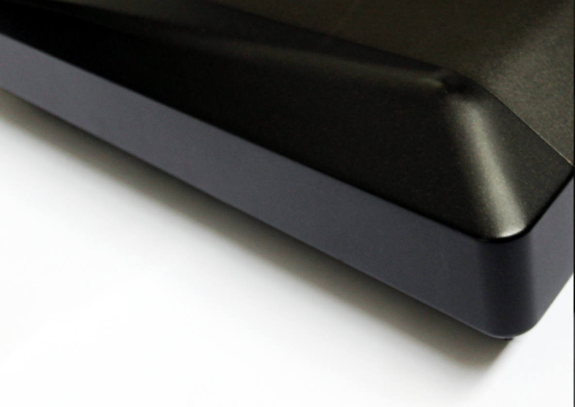
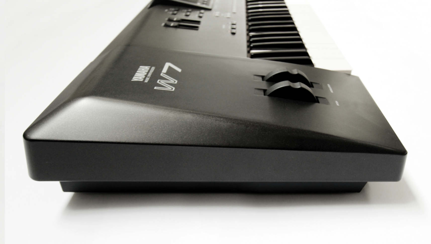
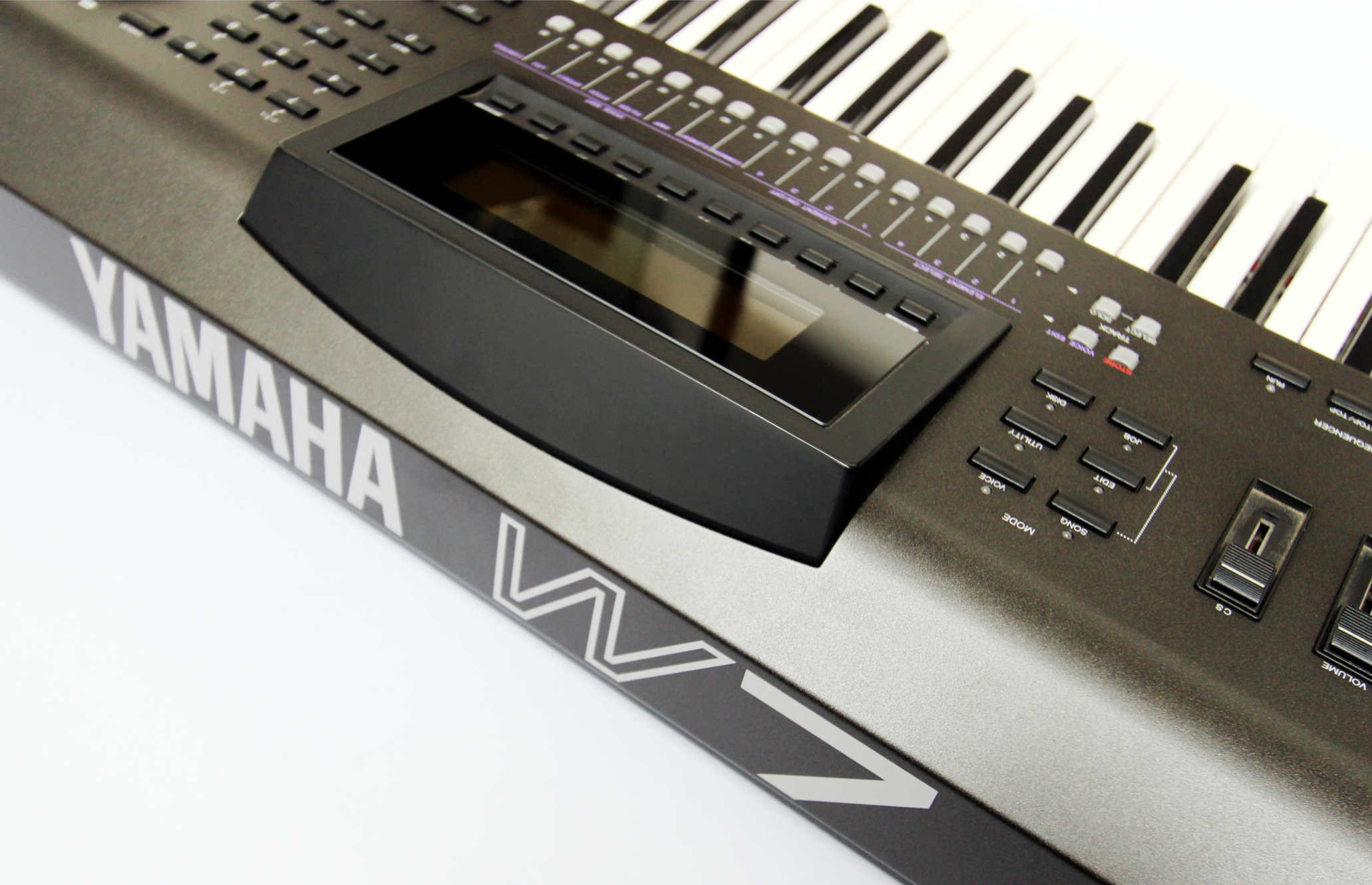
At first it appears to be a similar colour to the SY series, but on closer inspection there is a slight metallic silver in the black. This slight colour change is important as Yamaha has a tradition of introducing a new colour with each new Synthesizer range. The end panels have evolved from previous models to be simpler with a rounded off wedge shape. Upon closer inspection we came to appreciate the subtle beauty of this shape. It’s simple, gentle and nice to touch. The screen is one feature that stands out. While it’s the same size as the previous SY77 & SY99 models it is housed in a frame that angles it up from the main panel for easy reading. It looks almost as if it were meant to be adjustable but unfortunately is fixed. The other distinguishing characteristic of the W5 are the 16 small white translucent buttons under the screen. While they look like cute little sweets, they functionally a bit small and don’t feel so nice to press. They are also spaced a bit close together and we noticed that they often require servicing.
With so much space on the front panel it seems odd that the designers did not spread things out more or use larger buttons. Perhaps that was part of the minimalistic design trend of the mid 1990s. We don’t feel the button arrangement was well thought through and as a result the front panel looks rather empty and plain. Having said that the W7 looks more balanced to us than the longer W5. The expanses of flat metal are less vast and help the concentration of buttons look more proportionate.
Craftmanship.
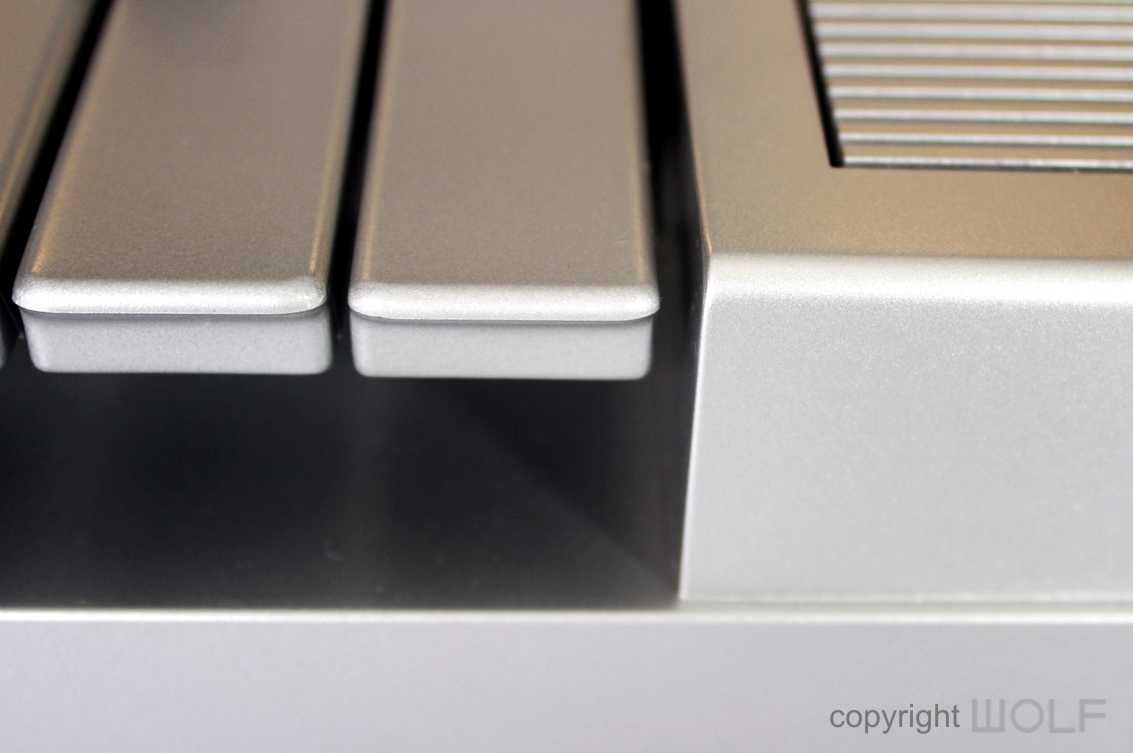
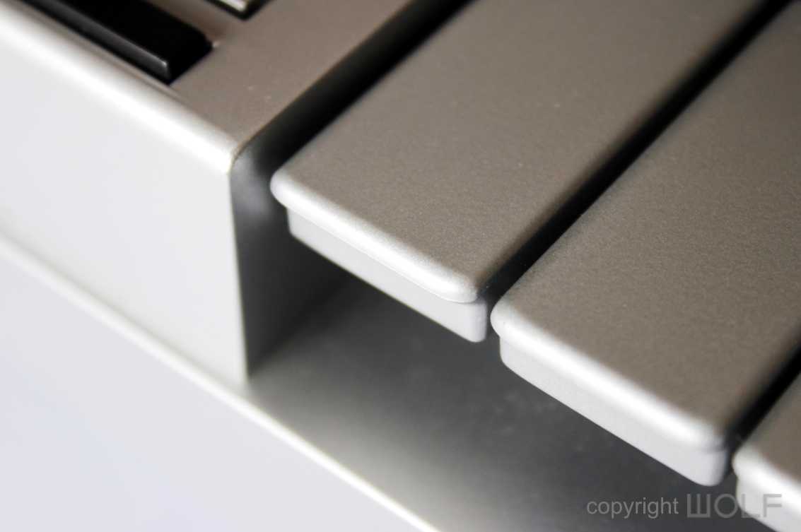
The W7 is put together well, as you would expect from most Yamaha products. The end panels fit flush and neat making it very clean and minimalistic. The main front aluminium panel does feel thinner somehow and the large flat surfaces are probably not as rigid as previous models. Most of the ones we’ve seen have scratches and dints. The keys on most also tend to be a little more yellowed than previous models. All this suggests that the materials used may have been cheaper and less durable
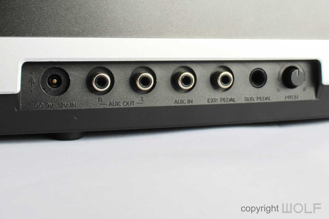
FUNCTION- Experience.
Our research tells us that the W5 was not a breakthrough in anyway. It was more of the same in a new package that looks underwhelming. We felt the screen is too small and the buttons don’t feel nice to press. The front panel arrangement is too condensed into one area and feels insufficient for a flagship model.
The new positioning of the disk drive looks neater that the SY model and does away with all those busy lines, but as a result has lost that clever space for holding a few disks which was rather useful.
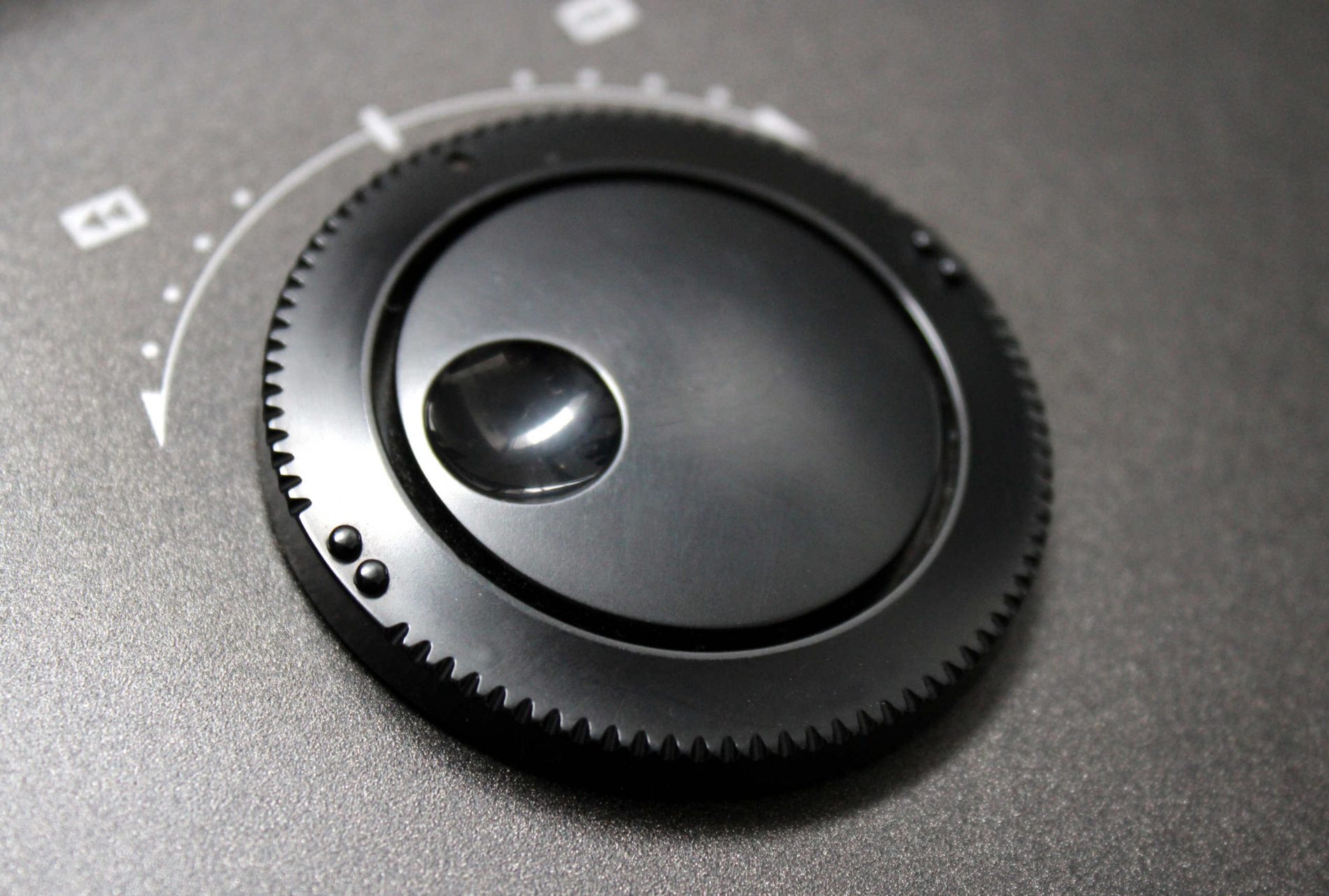
The W series also introduces a new double alpha dial. While this seems clever it is confusing and Yamaha never used it again on future models.
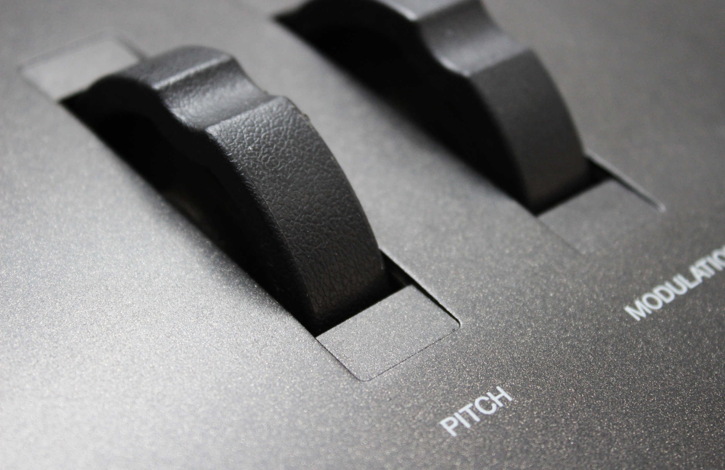
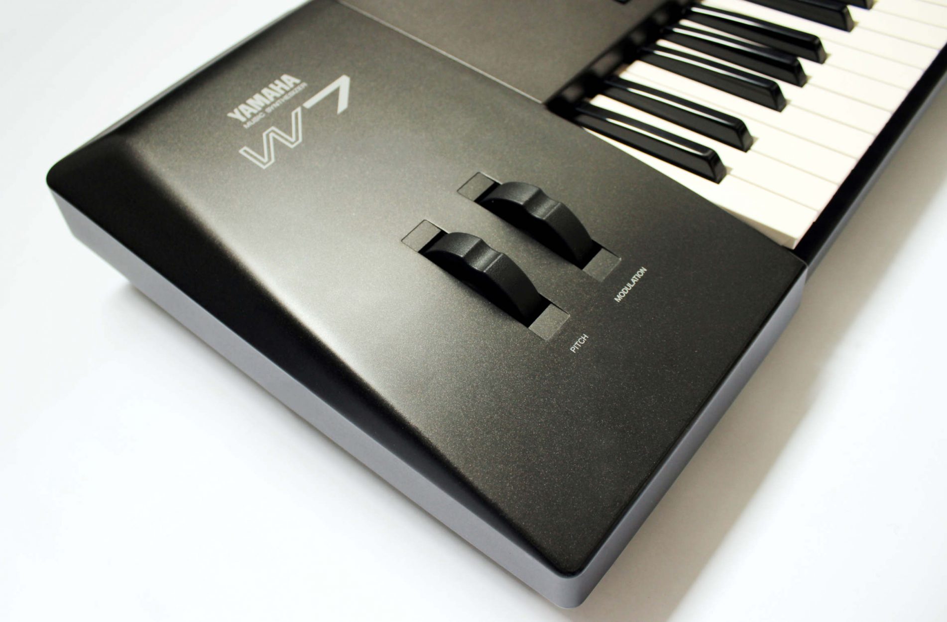
The Yamaha W synths also reverted back to just two controller wheels, but they introduced a rubberized texture (first released the previous year on the VL1), which was a nice touch and significant improvement over the all previous wheels.
Desirability / Collectability
The W7 is not as rare as big brother W5 but still scarce due to poor sales. It is still a powerful machine that had remained undervalued. It’s unlikely to significantly rise in value given that it was not a breakthrough in any way. Even from a design perspective its rather bland compared to most other models. All those flat surfaces mark easily so it will be hard to find clean units.
This is probably going to be the Yamaha flagship synthesizer that most will forget but we will make mention that it is probably much rarer than most other Yamaha synthesizers. The Version 2 will be slightly more valuable than the Version 1. At the time of this review we could not find any images of the original case for this machine.
WORD OF THE WOLF
It almost seems as if this synthesizer was forced onto the market because the SY99 was getting a bit old and they needed a new product to compete with other brands. In hind sight they probably could have just given the SY99 an upgrade until the EX5 model was ready and available in 1998.
Nevertheless, the W5 & W7 still form a part of the Yamaha’s Synthesizer story and if you do find yourself in front of a mint specimen it would be worth knowing that they are very rare. People are not going to rush into buying them when they come up for sale, so most likely you could demand a bargain.
The WOLF W7
The W7 was one of the last synths to complete the WOLF collection. While inexpensive they are rare and even more rare to find in Mint condition. Two specimens were purchase so that parts could be swapped to make one near mint example.
WOLF DESIGN EXCELLENCE SCORE = 5.8
Disclaimer
The information in this review is intended for informational or educational purposes to provide readers an understanding of how something may be seen from a certain design perspective. In this case it is from the view point of WOLF DESIGNS. As design is subjective this review should only be considered as an independent opinion. Information further to being of an opinion is provided to the best of our knowledge based on our own research at the time of doing the review. We cannot be held responsible for any inaccuracies or inconsistencies and reserve the right to change or update any content as appropriate.
The final responsibility of the design resides with the original manufacturer.